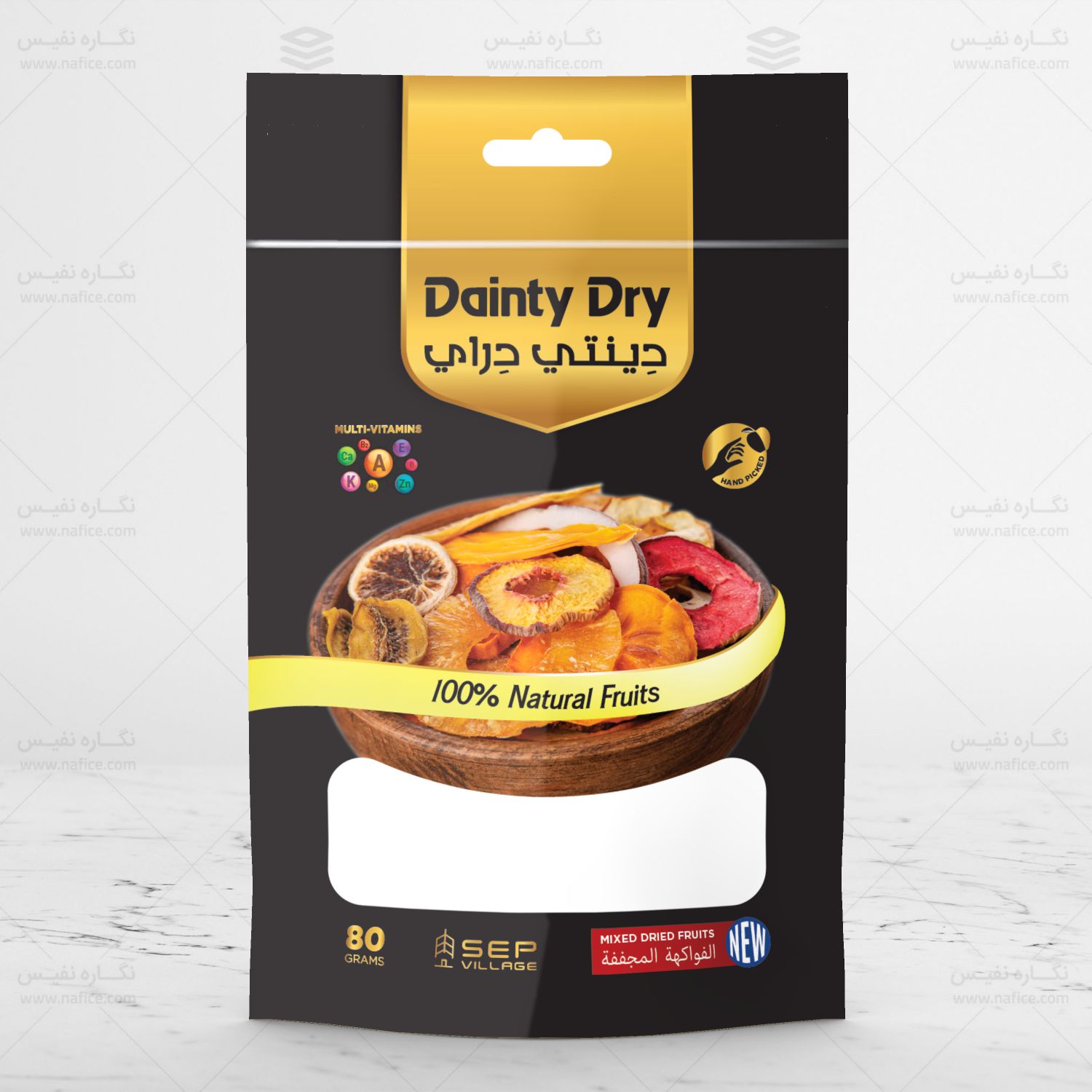
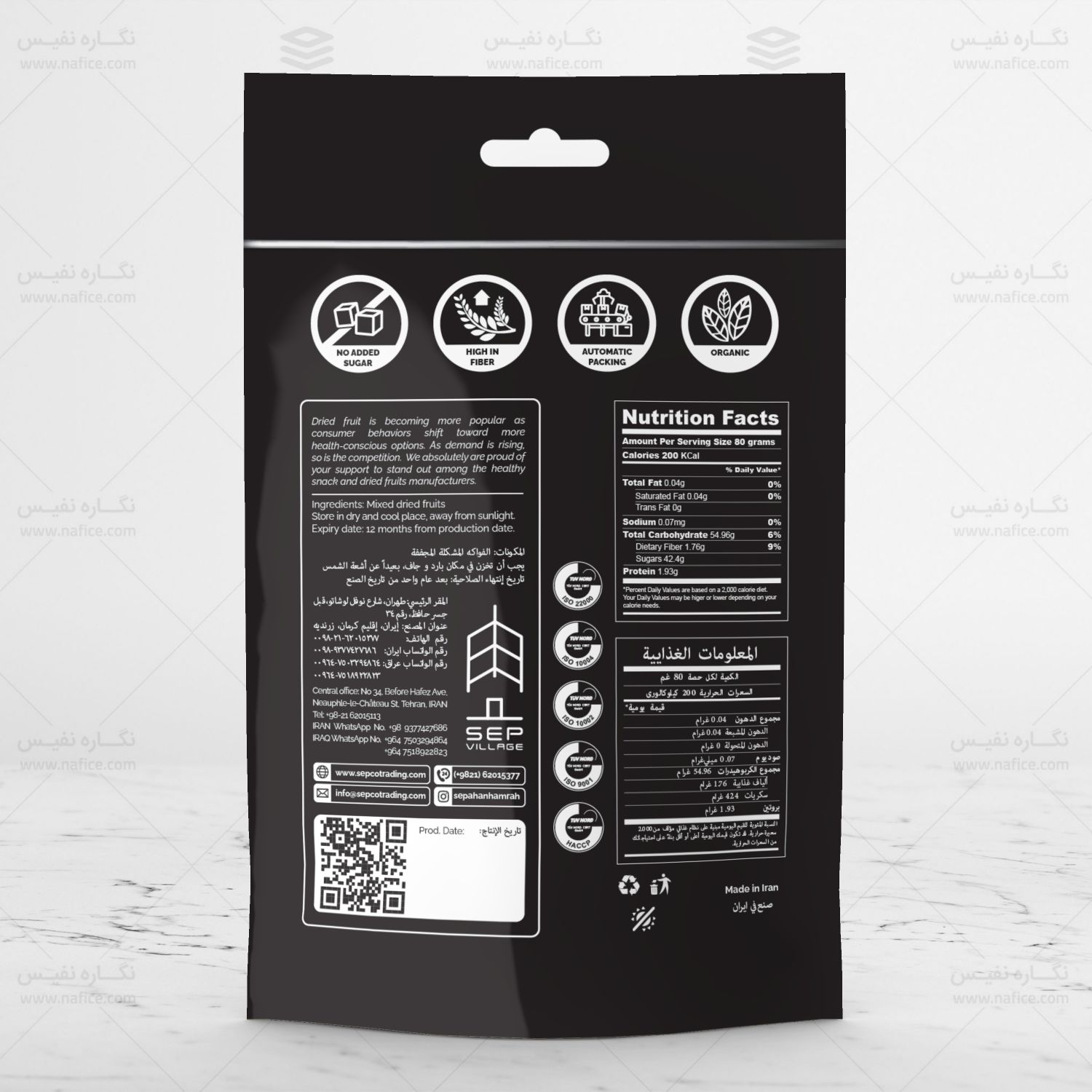
At Packsho Graphics, one of our recent projects was the packaging design for Dinty Dry’s mixed dried fruit pouch. This pouch contains 80 grams of mixed dried fruits and has been created to appeal to consumers in Gulf countries. The standing pouch features a black background with gold accents, giving it a luxurious and premium feel. The aim of this design is to create packaging that reflects the high quality of the product while also being visually captivating.
Luxurious and Elegant Design with Black and Gold
One of the standout features of this design is the use of a black background paired with gold elements, giving the packaging a sleek and sophisticated look. This color scheme is particularly attractive to customers in export markets like the Gulf countries, where luxury and aesthetics are highly valued. By incorporating these colors, we aim to communicate the premium nature of the product.
On the front of the pouch, there is a stunning image of a bowl filled with an assortment of dried fruits such as dried apples, bananas, pineapples, peaches, figs, and mangoes. This image not only showcases the product but also evokes the freshness and natural quality of the dried fruits.
Packaging Features
This dried fruit packaging is in the form of a standing pouch, which is designed to be convenient for storage and transportation. Standing pouches are popular because they take up less space and are easy for consumers to store in their kitchens. The material of the pouch is high-quality and durable, ensuring that the contents are protected from moisture and air, preserving the freshness and flavor of the dried fruits.
Target Market and Export Strategy
This dried fruit packaging is specifically designed for export to Gulf countries. At Packsho Graphics, we understand the importance of meeting international packaging standards to ensure competitiveness in foreign markets. The luxury design is intended to appeal to consumers who are looking for premium quality dried fruits.
In addition to being visually appealing, this packaging is also designed to be practical for both consumers and retailers. The standing pouch not only provides ease of use but also creates an attractive display on store shelves, drawing attention with its elegant design.
Branding and Design Consistency
The design of this packaging also takes into account the brand identity of Dinty Dry. Dinty Dry is known for offering high-quality, natural products, and the packaging reflects these values. The realistic, high-quality image of dried fruits on the front of the pouch emphasizes the freshness and natural quality of the product.
Moreover, the use of black and gold aligns with the brand’s strategy of conveying luxury and premium quality. These colors together create a sense of trust and reliability for consumers, reinforcing the product’s superior quality.
Product Protection and Convenience
Another key goal of this packaging design is to provide complete protection for the product against external factors. The standing pouch, made of durable materials, shields the dried fruits from air and moisture, ensuring that their flavor and freshness are preserved over time.
The lightweight and portable design of the packaging makes it easy to carry and store, and it fits comfortably into consumers’ shopping bags or kitchen shelves. The 80-gram size is ideal for everyday use or for taking along while traveling.

