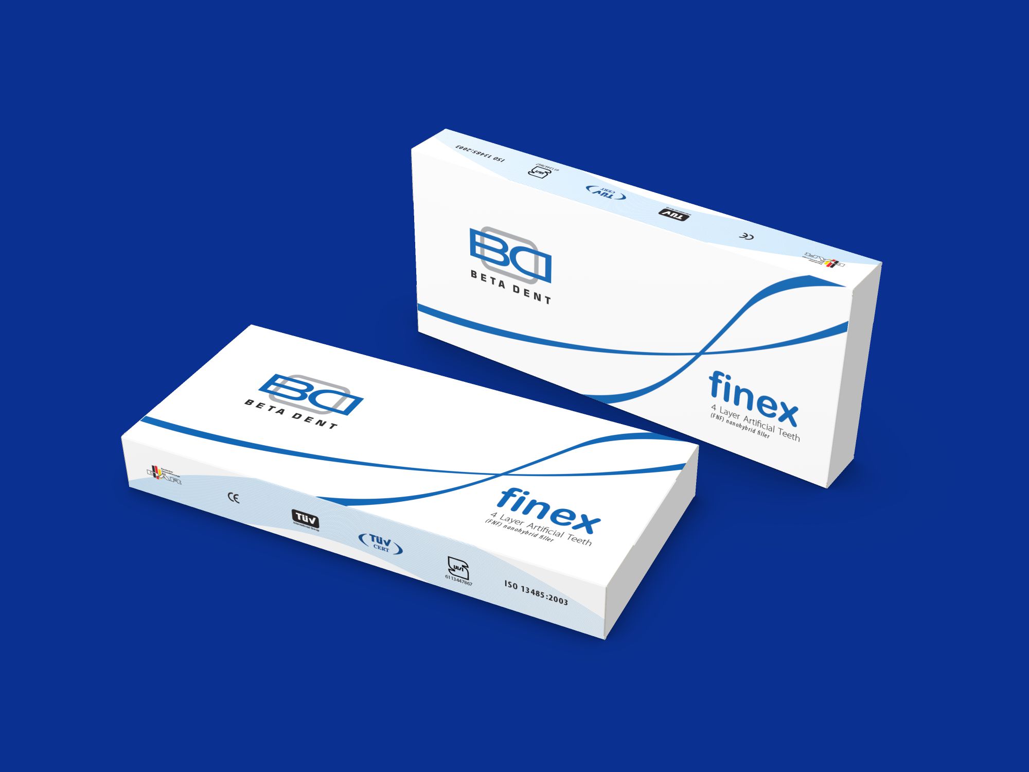
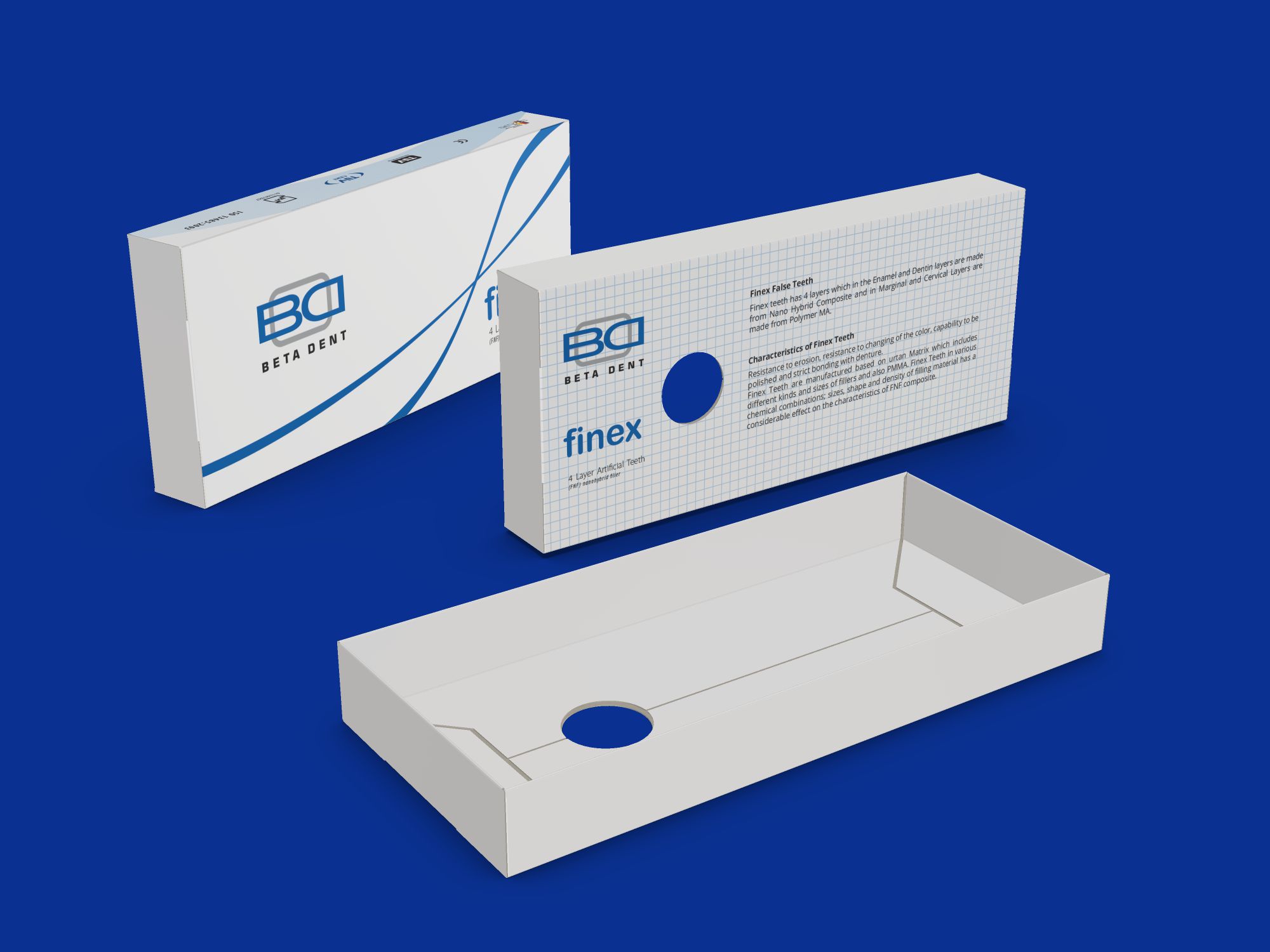
The packaging design for the “Finex” artificial teeth, manufactured by Beta Dent dental company, showcases a minimalist and visually refined approach. The “tray and top” type paperboard box is specifically designed to securely hold and present the set of artificial teeth with elegance and practicality.
The graphic design elements incorporated in the packaging demonstrate a high level of creativity while maintaining a minimalistic aesthetic. The strategic use of blue lines adds a touch of sophistication and reinforces the dental industry’s association with cleanliness and professionalism. The lines may symbolize precision, alignment, and harmony, reflecting the attention to detail and quality of the product.
The minimalistic design approach embraces simplicity and elegance, allowing the focus to be on the product itself. The clean typography and uncluttered layout contribute to a sleek and modern visual appeal. By avoiding excessive ornamentation, the packaging design communicates a sense of professionalism, precision, and reliability that aligns with the dental industry’s standards.
As a packaging designer, Packsho Graphics demonstrates a keen understanding of the balance between aesthetics and functionality. The die-line and structure of the “tray and top” type box are meticulously designed to provide optimal protection, organization, and easy access to the artificial teeth set. The branding and graphics designed by Packsho Graphics contribute to the overall visual coherence and reinforce the product’s identity as a high-quality dental solution.
The creativity lies in the ability to capture the essence of the product and convey it through a minimalistic approach. By utilizing the blue lines as a design element, Packsho Graphics adds visual interest and a touch of creativity while maintaining a clean and sophisticated overall look. The restrained design allows the “Finex” artificial teeth to take center stage, emphasizing their quality and craftsmanship.
In summary, the packaging design for the “Finex” artificial teeth by Packsho Graphics embraces minimalism and demonstrates creativity through the strategic use of blue lines and a clean layout. The design showcases professionalism, precision, and reliability, reflecting the standards upheld by Beta Dent dental company. The combination of functional die-line and structure, along with thoughtful branding and graphics, results in an aesthetically pleasing and cohesive packaging solution that enhances the overall customer experience.

